Multiple Choice
The multiple choice pattern allows the user to respond to a prompt and then provides feedback about their answer choice.
Beta This pattern is still a work in progress. Questions or concerns? Please let us know.
Anatomy
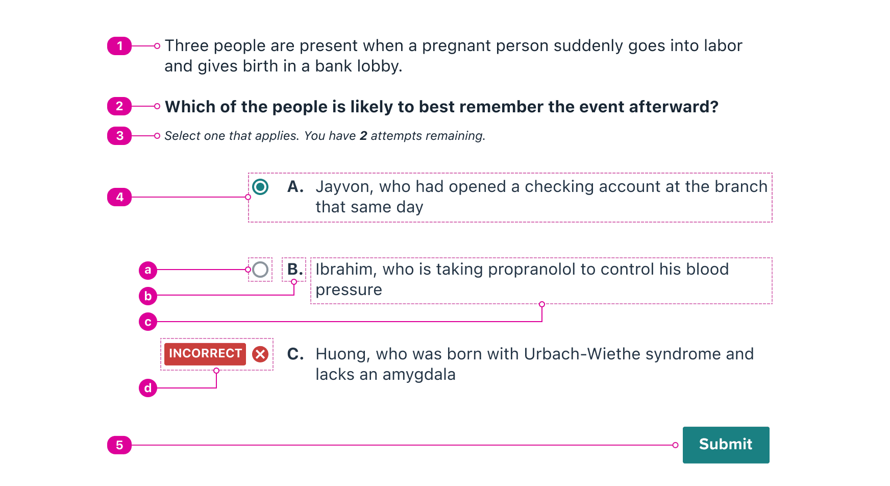
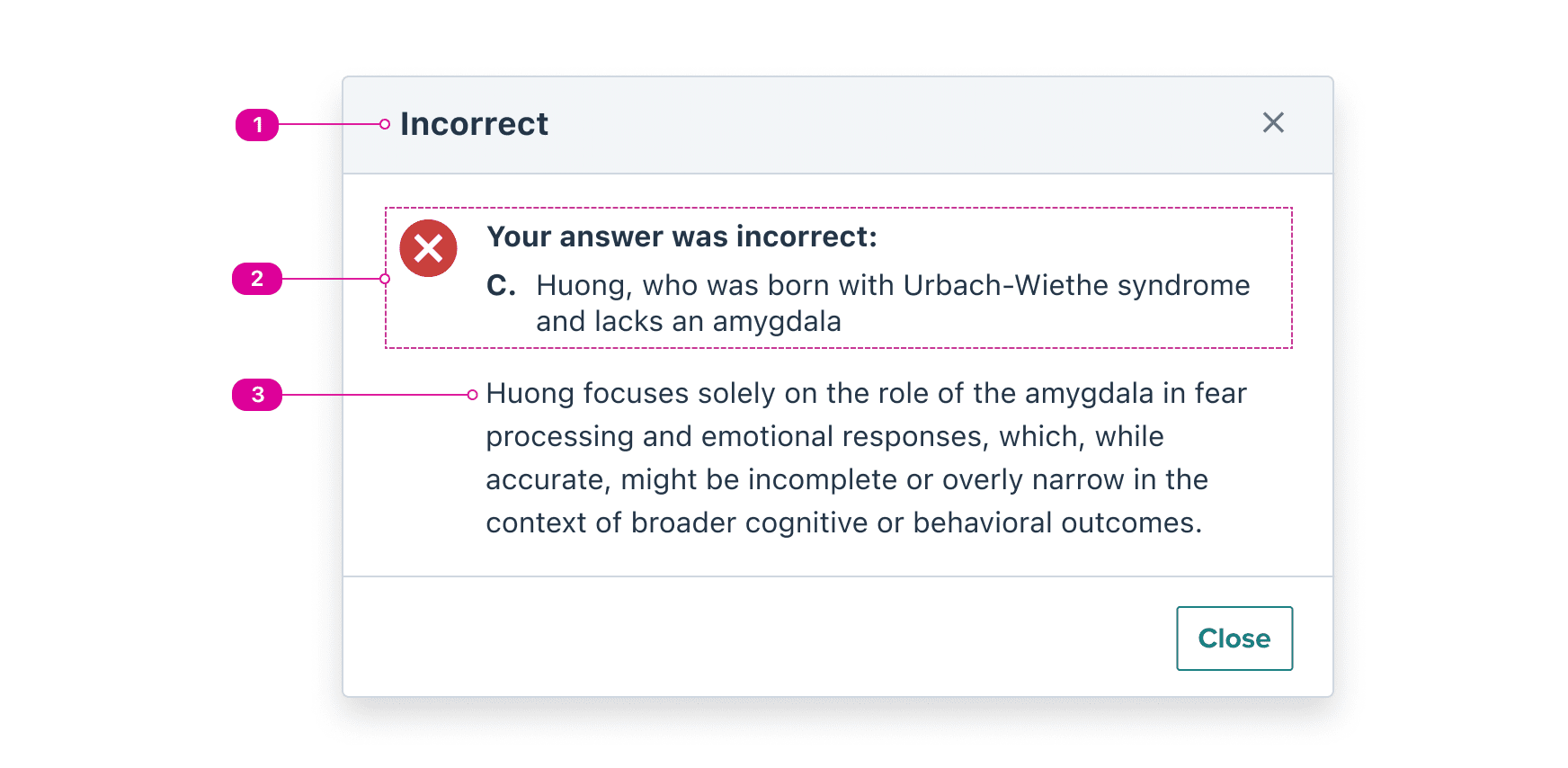
The Multiple Choice pattern contains two views that are presented sequentially in the user flow:
- A question view, where the user responds to a prompt by selecting an answer and then submitting it. Submitting a response immediately opens the feedback view.
- A feedback view, where the user learns whether they answered correctly and is presented with additional feedback about their answer. Closing the feedback returns the user to the response view.
Question
The question view presents a prompt to the user, allowing them to select and then submit their answer. Once submitted, the feedback view appears.

- Question Framing (optional) - introductory content that provides additional context for the question. This can include any type of content, including but not limited to text, images, and video.
- Question Stem - the text-only prompt. Answer choices are responses to the question stem.
- Functional Instructions (optional) - the constraints for answering the question. Unlike the stem and framing, this should not contain subject matter related to the question.
- Answer Choice - an option that answers the question.
- Selector - a radio button that indicates which choice is currently selected and will be submitted.
- Identifier - a letter or number that identifies the choice.
- Response - an answer that relates directly to the question stem.
- Response Indicator (only visible after submission) - a label that signifies whether a submitted response was correct or incorrect. Once visible, the answer choice can no longer be selected.
- Submit Button - a button that submits the chosen answer.
Feedback
Feedback is presented in a modal dialog after the user has submitted an answer. Once closed, the user should be returned to the question view.

- Title - the title should summarize the result of the user's submission in as few words as possible.
- General Feedback - the answer that the user submitted and whether it is correct or incorrect.
- Supplementary Feedback (optional) - additional answer-specific content.
Design Guidelines
Following these guidelines will help us create a more consistent experience of multiple choice questions throughout Norton products.
Display the stem and answer choices in the same view
The question stem and its corresponding answer choices should be viewable together, rather than presenting them in separate views or requiring the user to scroll to view them together.
Provide no more than 5 answer choices
We've chosen 5 as the Norton Design System's preferred limit for most cases, but this depends heavily on the amount of information in the stem and answer choices.
Deliver answer feedback in its own view
When feedback is displayed directly in the question view, it's impossible to guarantee that the user will notice it or absorb it. The Norton Design System has chosen to use our modal for feedback in order to bring focus to it.
Keep the stem and instructions clear and brief
Both the question stem and the functional instructions give question authors a space to outline requirements for answering the question. These should follow the rule of accurate, clear, brief (in that order)
Always use visible text for answer choice feedback
Avoid using icons or color alone to convey whether the response was correct or incorrect. Text is the only way to guarantee that the meaning will be understood by all users.
This supports low-vision users, English language learners, and users with cognitive disabilities.
Use a consistent answer choice identifier
The Norton Design System allows answer choice identifiers to be Roman numerals, numbers, or letters to suit the needs of the application. Avoid mixing these across the same set of questions.
React API
Our implementation includes components for the Question view and the Feedback view, as well as a hook to help manage state across views.
The following code demonstrates one way to compose the components and hook together. Head to the Multiple Choice Storybook to view a live example.
import {
	MultipleChoiceQuestion,
	MultipleChoiceFeedback,
	useMultipleChoice,
	Button,
} from "@wwnds/react";

export function MultipleChoice({ choices }: { choices: string[] }) {
	const { questionState, setStatus, modalState } = useMultipleChoice(choices);

	const handleSubmit = useCallback(
		(event: React.FormEvent<HTMLFormElement>) => {
			event.preventDefault();
			// check if the user submitted the correct answer or not.
			// for instance, use setStatus("correct") if they got it right.
		},
		[setStatus, questionState.selected],
	);

	return (
		// note that the <form> and <Button> are not part of the Multiple Choice
		// pattern's public API but are used to handle choice submission.
		<form onSubmit={handleSubmit}>
			<MultipleChoiceQuestion
				framing="..."
				stem="..."
				{...questionState}
			/>
			<MultipleChoiceFeedback {...modalState} />
			<Button type="submit" variant="solid">
				Submit
			</Button>
		</form>
	);
}
MultipleChoiceQuestion Component
The MultipleChoiceQuestion component is used to render the multiple choice question. It accepts the following props:
| Name | Description | Type |
|---|---|---|
framing | Introductory content that provides additional context for the question. This can include any type of content, including but not limited to text, images, and video. | string | ReactElement<void, ({ children }: { children?: ReactNode; }) => Element> |
stem (required) | The text-only prompt. Answer choices are responses to the question stem. | string | ReactElement<void, ({ children }: { children?: ReactNode; }) => Element> |
instructions | Instructions about the constraints for answering the question. Unlike the stem and framing, this should not contain subject matter related to the question. | string | ReactElement<void, ({ children }: { children?: ReactNode; }) => Element> |
choices (required) | The list of potential answers the question. | string[] |
identifierType | The type for the letter or number that identifies the choice. | AnswerChoiceIdentifierType |
status (required) | The current state of the question. | "incorrect" | "correct" | "unanswered" |
onSelect | Callback function that is called when the user selects a choice. | ((choice: ChoiceObject) => void) |
selected | The index of the currently selected answer choice. | number |
readOnly | When in read only, the user can no longer select a new answer. | boolean |
MultipleChoiceFeedback Component
The MultipleChoiceFeedback component extends our Modal component and inherits all of its props except the ones related to the title.
| Name | Description | Type |
|---|---|---|
baseName | string | |
isOpen | Indicates whether the Modal dialog is open. | boolean |
onRequestClose | Callback function that is called when the Modal would like to close. This will happen under the following conditions:
To close the Modal when | (() => void) |
hideTitle | Indicates that the title should be visually hidden. It will still be accessible to screen reader users. | boolean |
hideCloseButton | Indicates that the built-in close button in the top right should not be rendered. | boolean |
actions | A list of actions or React Fragment that will be set inside an action bar at the bottom of the Modal dialog. | ReactElement<unknown, string | JSXElementConstructor<any>> | Iterable<ReactNode> | ReactElement<ButtonProps, string | JSXElementConstructor<...>>[] |
headerClass | string | |
titleClass | string | |
closeButtonClass | string | |
actionBarClass | string | |
onOpen | (() => void) | |
stickyHeader | Indicates whether the header should stick to the top of the screen. Only has an effect when the modal's content is longer than the window height and the user scrolls enough to move the header above to top of the screen. | boolean |
stickyActionBar | Indicates whether the footer should stick to the bottom of the screen. Only has an effect when the modal's content is longer than the window height and the footer is below the bottom of the screen. | boolean |
focusOnOpen | An element that should be focused on open. If none is specified, the first focusable element in the Modal will be focused. If none can be found, the header or content will be focused. | HTMLElement |
closeOnBackdropClick | Indicates whether clicking the backdrop should close the Modal dialog. | boolean |
closeOnEscape | Indicates whether Escape should close the Modal dialog. | boolean |
mountPoint | A function that returns an element where the Modal dialog should be
attached to the DOM. Default is the | (() => HTMLElement) |
backdropClass | string | |
contentClass | string | |
portalClass | string | |
headerRef | Ref<HTMLElement> | |
contentRef | Ref<HTMLElement> | |
actionBarRef | Ref<HTMLElement> | |
modal | boolean | |
isCorrect | If the general feedback to give is "correct". | boolean |
choiceLabel (required) | The label which identifies the selected choice | string |
choiceText (required) | The text of the selected choice | string |
useMultipleChoice Hook
The useMultipleChoice hook is used to manage the state of the multiple choice question.
It accepts an array of answer choices and returns the state shared by the FeedbackModal and MultipleChoice components.