Modal
A modal presents important information or simple tasks to the user in an overlay.
Anatomy
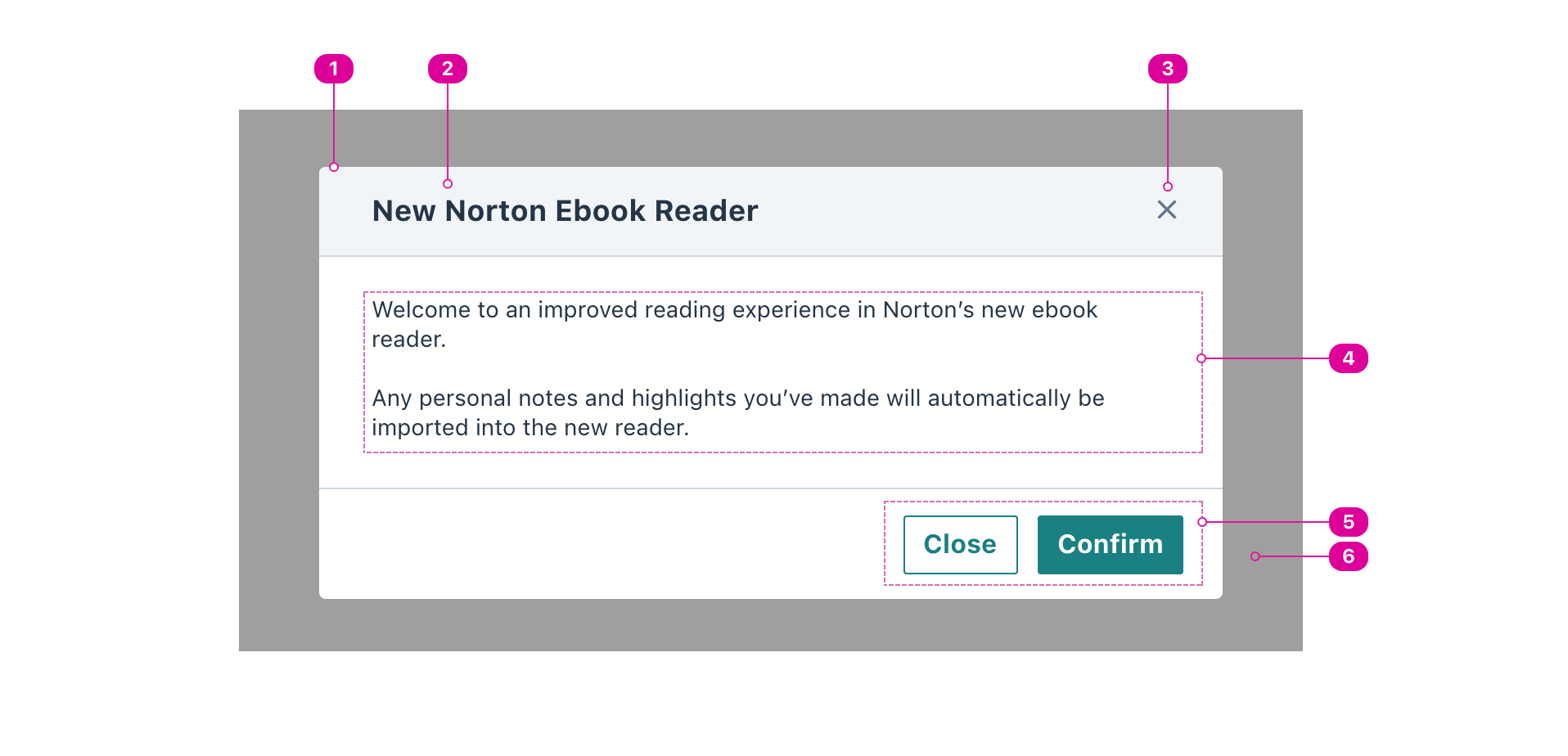
- Modal container - the modal container provides a boundary for the contents of the modal.
- Title (recommended) - the name of the modal lets the user know what to expect from it and functions as a header for the body of the modal.
- Close Button (optional) - a button that will always close the modal.
- This should always be included when no other controls exist inside the modal.
- Body - the main content of the modal presents important information to the user or asks them to perform simple tasks before exiting the modal.
- Action Buttons (optional) - one or more actions that will result in the dismissal of the modal.
- Backdrop Overlay - an overlay that prevents the user from interacting with the page’s main content.
Usage
Use modals to present important information or simple tasks to the user, disabling all access to the main content while the modal is active. Modals are sometimes called "modal dialogs" because they create a dialog between the application and the user in a different modality from the main content.
React API
import { Modal } from '@wwnds/react';
Modal
function ModalWithButton() {
	const [isOpen, setIsOpen] = React.useState(false);
	const open = () => setIsOpen(true);
	const close = () => setIsOpen(false);
	return (
		<>
			<Button variant="solid" onClick={open}>Open the modal</Button>
			<Modal
				title="Confirm the prompt"
				isOpen={isOpen}
				onRequestClose={close}
				actions={(
					<>
						<Button variant="outline" color="base" onClick={close}>
							Also confirm
						</Button>
						<Button variant="solid" onClick={close}>
							Confirm
						</Button>
					</>
				)}
			>
				<p>
					This is a demo modal.
					Real modals should have useful information here.
				</p>
			</Modal>
		</>
	);
}
| Name | Description | Type |
|---|---|---|
isOpen | Indicates whether the Modal dialog is open. | boolean |
title (required) | The name of the Modal dialog. Required for accessibility but can be
visually hidden with the | string |
hideTitle | Indicates that the title should be visually hidden. It will still be accessible to screen reader users. | boolean |
hideCloseButton | Indicates that the built-in close button in the top right should not be rendered. | boolean |
actions | A list of actions or React Fragment that will be set inside an action bar at the bottom of the Modal dialog. | ReactElement<unknown, string | JSXElementConstructor<any>> | Iterable<ReactNode> | ReactElement<ButtonProps, string | JSXElementConstructor<...>>[] |
stickyHeader | Indicates whether the header should stick to the top of the screen. Only has an effect when the modal's content is longer than the window height and the user scrolls enough to move the header above to top of the screen. | boolean |
stickyActionBar | Indicates whether the footer should stick to the bottom of the screen. Only has an effect when the modal's content is longer than the window height and the footer is below the bottom of the screen. | boolean |
focusOnOpen | An element that should be focused on open. If none is specified, the first focusable element in the Modal will be focused. If none can be found, the header or content will be focused. | HTMLElement |
closeOnBackdropClick | Indicates whether clicking the backdrop should close the Modal dialog. | boolean |
closeOnEscape | Indicates whether Escape should close the Modal dialog. | boolean |
mountPoint | A function that returns an element where the Modal dialog should be
attached to the DOM. Default is the | (() => HTMLElement) |
baseName | string | |
backdropClass | string | |
headerClass | string | |
titleClass | string | |
closeButtonClass | string | |
contentClass | string | |
actionBarClass | string | |
portalClass | string | |
onRequestClose | Callback function that is called when the Modal would like to close. This will happen under the following conditions:
To close the Modal when | (() => void) |
onOpen | (() => void) | |
headerRef | Ref<HTMLElement> | |
contentRef | Ref<HTMLElement> | |
actionBarRef | Ref<HTMLElement> | |
modal | boolean |