Callout
A callout brings attention to important information that is related to the main content.
Anatomy
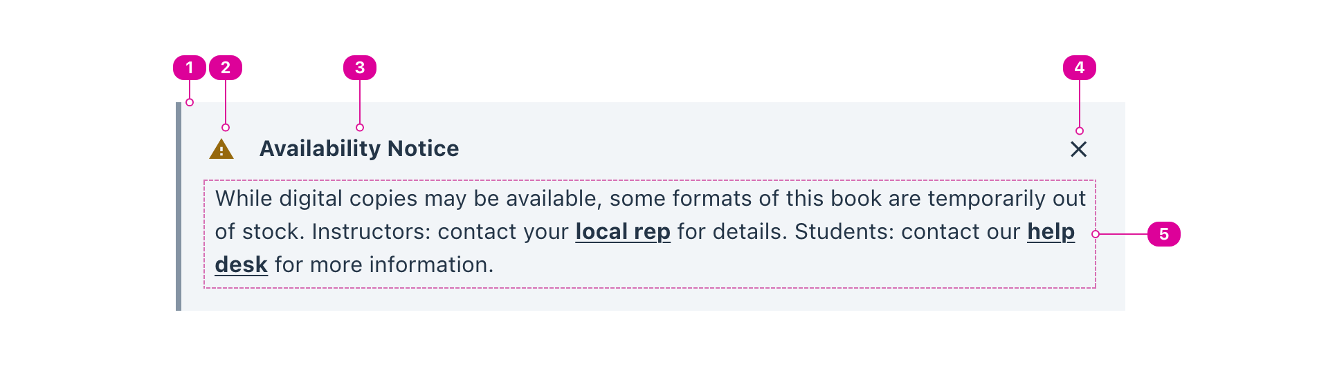
- Container - the container sets the contents of the callout apart from the main content.
- Icon (optional) - an icon can be used to add character or emphasize the title.
- Title (recommended) - the title of a callout summarizes its contents.
- Dismiss Button (optional) - a control that allows the user to dismiss the callout.
- Body - the contents of the callout.
Usage
Use a callout to bring attention to important information that is related but set apart from the main content. Effective callouts emphasize, summarize, or provide additional information about the main content, but they should also be clear as standalone snippets of information. In other words, callouts should make sense both in context and out of context.
Presets
Three preset callouts are provided to emphasize "success," "warning," and "error" in a consistent way.
Be careful to always provide a title for these presets, as color and icons alone will never convey meaning to everyone. A clear title will ensure that screen reader users and users with color blindness can still understand the role of the callout.
React API
Callout
import { Callout } from '@wwnds/react';
<Callout title="Lorem Ipsum" icon="star" border="left" dismissible>
	<p>
		Lorem Ipsum is simply dummy text of the printing and typesetting industry.
		Lorem Ipsum has been the industry's standard dummy text ever since the 1500s,
		when an unknown printer took a galley of type.
	</p>
</Callout>
| Name | Description | Type |
|---|---|---|
title | The title summarizes the callout's contents. | string |
icon | An icon can be added for character or to emphasize the callout's title. | IconVariant | SVGIcon |
color | The callout's color family. | "base" | SystemColors | "warning" | "primary" | "error" | "success" |
border | The position of the border. | CombinedListOfFour<"top" | "right" | "bottom" | "left"> |
dismissible | Indicates whether callout can be dismissed. | boolean |
tag | The HTML element used for the callout. This will default to
| "aside" | "div" |
onDismiss | Callback function that is called when the callout is dismissed. | (() => void) |
baseName | The base class name according to BEM conventions. | string |
iconClass | The className that will be applied to the callout icon. | string |
headerClass | The className that will be applied to the callout header element. | string |
titleClass | The className that will applied to the callout title. | string |
dismissClass | The className that will be applied to the close Button. | string |
bodyClass | The className that will be applied to the callout's body container | string |
Callout Presets
Each of the three presets use the main Callout's props but sets a default border, color, icon, and title for your convenience.
import { CalloutError, CalloutSuccess, CalloutWarning } from '@wwnds/react';