Tabs
Tabs allow the user to select layered sections of content to display within the same space.
Anatomy
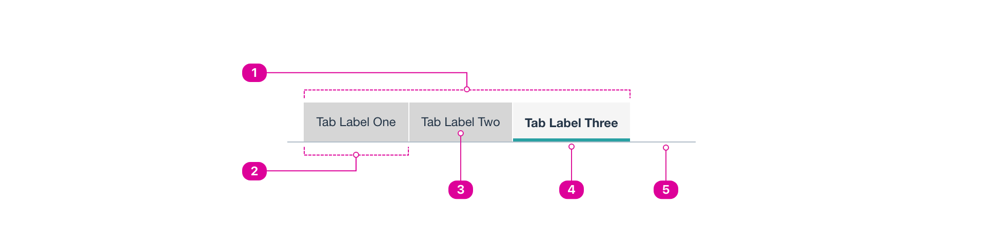
- Tab list – A horizontal arrangement of selectable tab elements that serve as a navigation interface.
- Tab Container – An outline, background color, or extra space that sets the tab apart from adjacent tabs.
- Label – a short title that lets the user know what content is contained in the tab.
- Selected Tab Marker- A visual indication of the selected open tab.
- Tab Panel – The divider separating the tab list from the tab content.
Usage
- Use tabs to organize and present related content together while keeping the focus in the same place.
- The selected tab must have a clear indicator showing that it is selected.
- Tabs are commonly displayed horizontally.
- The tab list should always be positioned along one edge of the tab panel.
- Tabs should always include visible text labels. Tab labels may contain an icon in addition to text. All tab labels in the same tab list must follow the same pattern, whether they include text only or text and an icon.
- On mobile, tab bars may scroll if there is not enough space to display all of the tabs at once. It should be clear to users that there are more tabs that they can scroll through.
- Tabs should always take up the full width of the page or screen with no other components beside them.
Tabs & Menus
- Tabs and menus can be similar and even styled the same in some cases. Tabs are for displaying layered pieces of content, and menus are for navigation. Tabbed menus may look like tabs but functionally be navigating users to a different link, and menus move focus.
React API
The Tabs are implemented by combining the following components:
Tabs: Wrapper Component, it orchestrates the internal state.TabList: A list ofTabcomponents.Tab: The Tab button, when the user activates this, the correspondingTabPanelis displayed.TabPanels: A list ofTabPanelcomponents.TabPanel: A wrapper for the content corresponding to a given "Tab".
When the user clicks on a Tab the TabPanel with same index is shown.
The index for Tab components is calculated based on order of appearance of each Tab from top to bottom inside the TabList.
Likewise, the index for TabPanel components is based on order of appearance from top to bottom as well, but this time inside TabPanels component.
<Tabs>
	<TabList>
		<Tab>Tab 1</Tab> {/* Index is 1 */}
		<div> {/* You can add any arbitrary elements, it won't affect indexing */}
			<Tab>Tab 2</Tab> {/* Index is 2 */}
		</div>
	</TabList>
	<TabPanels>
		<TabPanel>Content 1</TabPanel> {/* Index is 1 */}
		<div></div> {/* Won't affect indexing */}
		<TabPanel>Content 2</TabPanel> {/* Index is 2 */}
	</TabPanels>
</Tabs>
Basic Usage
import { Tabs, TabList, Tab, TabPanels, TabPanel } from '@wwnds/react';
<Tabs>
	<TabList>
		<Tab>Cats</Tab>
		<Tab>Dogs</Tab>
		<Tab>Horses</Tab>
		<Tab>Cows</Tab>
	</TabList>
	<TabPanels>
		<TabPanel>Cats content</TabPanel>
		<TabPanel>Dogs content</TabPanel>
		<TabPanel>Horses content</TabPanel>
		<TabPanel>
			Cows content
			{' '}
			<Button onClick={() => console.log('Moo!')}>Moo!</Button>
		</TabPanel>
	</TabPanels>
</Tabs>
Accessibility
This is an implementation of the WAI-ARIA Tab Pattern with Manual Activation. Keyboard navigation is implemented as specified in that pattern.
Tabs
Tabs is the component that wraps and orchestrates the internal state.
<Tabs>
	<TabList>
		<Tab>Tab 1</Tab>
		<Tab>Tab 2</Tab>
	</TabList>
	<TabPanels>
		<TabPanel>Content 1</TabPanel>
		<TabPanel>Content 2</TabPanel>
	</TabPanels>
</Tabs>
| Name | Description | Type |
|---|---|---|
selectedIndex (required) | The currently active tab, for controlled use only | number |
onChange (required) | Callback for when the user interacts with one of the | (selectedIndex: number) => void |
idPrefix | Prefix used to replace the autogenerated | string |
align | Adjusts the tabs alignment. Alignments available:
Defaults to | "center" | "left" |
variant | Adjusts the variant. Variants Available:
Defaults to | "line" | "contained" |
className | string | |
defaultSelectedIndex | Sets the default active tab, for uncontrolled use only.
Will be ignored if the | number |
TabList
TabList contains a set of Tab components. Renders a component with tablist role.
<TabList>
	<Tab>Tab 1</Tab>
	<Tab>Tab 2</Tab>
</TabList>
Tab
Tab renders a Button with the tab role. An index is assigned to the tab internally that identifies which TabPanel this tab controls, the index is assigned by order of appearance from top to bottom.
<Tab>Tab 1</Tab>
TabPanels
TabPanels contains a set of TabPanel components.
<TabPanels>
	<TabPanel>Content 1</TabPanel>
	<TabPanel>Content 2</TabPanel>
</TabPanels>
TabPanel
TabPanel renders, when active, the content of the panel wrapped inside an element with tabpanel ARIA role.
The TabPanel is active, if the tab that controls it is activated. Each TabPanel is assigned an index
based on the order of appeared of the panel inside the TabPanels component from top to bottom, this index is used
to know which Tab inside TabList controls any given TabPanel.
<TabPanel>Content 1</TabPanel>
Style Variants
Centered Alignment
<Tabs align="center">
	<TabList>
		<Tab>Cats</Tab>
		<Tab>Dogs</Tab>
		<Tab>Horses</Tab>
		<Tab>Cows</Tab>
		<Tab>Beavers</Tab>
	</TabList>
	<TabPanels>
		<TabPanel>Cats content</TabPanel>
		<TabPanel>Dogs content</TabPanel>
		<TabPanel>Horses content</TabPanel>
		<TabPanel>Cows content</TabPanel>
		<TabPanel>Beavers content</TabPanel>
	</TabPanels>
</Tabs>
Line Variant
<Tabs variant="line">
	<TabList>
		<Tab>Cats</Tab>
		<Tab>Dogs</Tab>
		<Tab disabled>Horses</Tab>
		<Tab>Cows</Tab>
		<Tab>Beavers</Tab>
	</TabList>
	<TabPanels>
		<TabPanel>Cats content</TabPanel>
		<TabPanel>Dogs content</TabPanel>
		<TabPanel>Horses content</TabPanel>
		<TabPanel>Cows content</TabPanel>
		<TabPanel>Beavers content</TabPanel>
	</TabPanels>
</Tabs>