Tooltip
A tooltip displays the name of or description for a related element on demand.
Anatomy
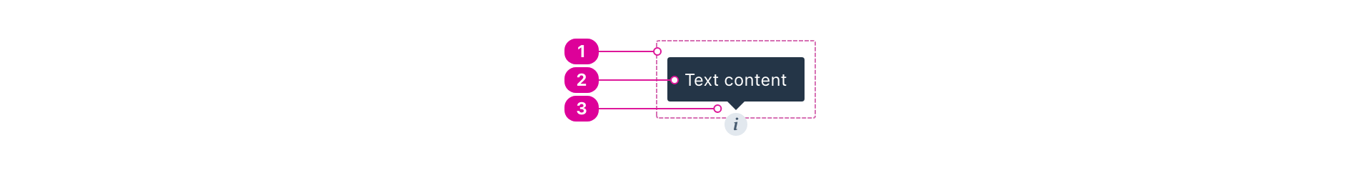
- Tooltip Container - an outline or background sets the tooltip apart.
- Text - tooltip text names or describes a related element.
- If the related element does not have a name, the tooltip text is used to name it.
- If the related element already has a name, the tooltip text is used to add description to the related element.
- Arrow - a visual indicator that points to the related element.
Usage
Use tooltips when there is not enough physical space to display the name or description of an interactive element. Tooltips provide a mechanism for a simplifying the visual design of an interface. But in exchange, users will have a harder time understanding and discovering the role of the tooltipped element, so use them sparingly and thoughtfully.
Naming and describing
In the Norton design system, a tooltip can only be used to name or describe its related element. This restriction ensures that the user experience of the tooltip is consistent for everyone.
Naming
A tooltip is said to be naming its related element when it is acting as a label for that element. For instance, an icon button's call to action could be captured as a tooltip to ensure that the purpose of the icon button is clear to everyone. If the element contains textual content and you also want to use a tooltip to add additional context, the tooltip should be a describing tooltip.
Describing
A tooltip is said to be describing its related element when it is acting as additional or supplemental information about an element that already has a name.
For instance, an <input> that already has an associated <label> could use a tooltip to display help text about the expected input format.
React API
import { Tooltip } from '@wwnds/react';
Tooltip
function ButtonWithTooltip() {
	const [button, setButton] = React.useState(null);
	return (
		<div style={{ margin: '2rem 0' }}>
			<Button variant="solid" ref={setButton}>I'm a reference element</Button>
			<Tooltip
				isOpen
				placement="top"
				reference={button}
			>
				I'm a tooltip!
			</Tooltip>
		</div>
	);
}
| Name | Description | Type |
|---|---|---|
baseName | The base class name according to BEM conventions. | string |
bodyClass | A className to apply to the body of the tooltip. | string |
contentClass | A className to apply to the content. Default will be | string |
arrowClass | A className to apply to the arrow. Default will be | string |
asLabel | Indicates that the tooltip is labelling the reference. If Reference: | boolean |
trigger | A space-separated string of events. Triggers can be any combination of the following:
| string |
isOpen | Used to control whether the popper is open or closed. | boolean |
transition | The animation transition class applied to the popper as it enters or exits. A single name can be provided and it will be suffixed for each stage. For example,
Each individual stage can also be specified independently: Reference: react-transition-group's CSSTransition. | string | CSSTransitionClassNames |
reference | The reference element that the popper will be attached to. | ReferenceElement | null |
arrowElement | The element that should be used for the arrow. See the | string | Element | MutableRefObject<Element | null> | null |
distance | The offset distance
(in pixels) from the reference. Will only be used if | number |
boundary | The element or area where the popper will be checked against for overflow. See the | Boundary | "clippingParents" |
placement | The Floating UI placement option. | "auto" | Placement | "auto-start" | "auto-end" |
modifiers | Legacy Popper modifier objects. Supported names: | { name?: string; enabled?: boolean | undefined; options?: Record<string, unknown> | undefined; }[] | undefined |
strategy | The Floating UI strategy option. | Strategy |
onFirstUpdate | Called after the popper receives its first computed position while open. | ((state: { elements: { popper: HTMLElement; reference: ReferenceElement; }; placement: Placement; }) => void) |
hideDelay | The duration in milliseconds that should elapse before closing, beginning
after the pointer exits the reference's bounding box. Only has an effect
for the | number |
showDelay | The duration in milliseconds that should elapse before opening, beginning
after | number |