Dropdown
A dropdown allows the user to select an option from a list of options in an expandable overlay.
Anatomy
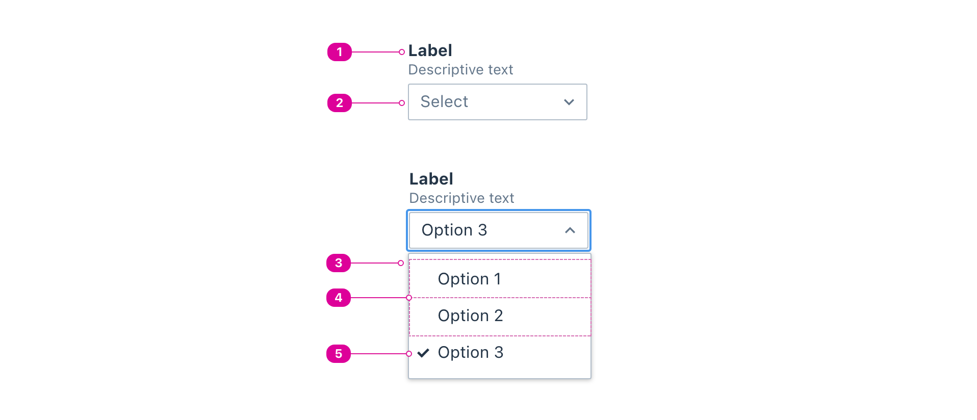
- Label - a short description or prompt that lets the user know what they will be selecting.
- Button - a button that opens the dropdown listbox and displays the currently selected option.
- Default text before selection should be "Select".
- A marker should be displayed to the right of the button's text to convey whether the dropdown listbox is open or closed.
- Listbox - a container for the list of options that only appears when opened by the dropdown button.
- Options - the available options. Clicking an unselected option will select that option, deselect the currently selected option, and close the listbox.
- Selected Option - the currently selected option.
Usage
- Use a dropdown to select one option from a collapsed set of available options.
- By default, dropdown options are mutually exclusive. The user can only select 1 option.
- When an option is selected, the dropdown closes and the selected option updates to display that item.
- On load, the dropdown should display default text of
"Select". The user should be able to change it back to"Select"if they wish. - Down Arrow/Up Arrow moves focus to the next/previous options, respectively.
- Home and End moves focus to the first/last options, respectively.
React API
We expose two components for the dropdown API: the Dropdown and the Option, which uses the BaseOption.
import { Dropdown, Option } from '@wwnds/react';
Dropdown
The Dropdown component does not expose a ref or extend a full DOM interface.
<Dropdown label="Choose a sitcom" sort="ascending">
	<Dropdown.Option>The Office</Dropdown.Option>
	<Dropdown.Option>Community</Dropdown.Option>
	<Dropdown.Option>Friends</Dropdown.Option>
	<Dropdown.Option>Parks and Recreation</Dropdown.Option>
	<Dropdown.Option>How I Met Your Mother</Dropdown.Option>
	<Dropdown.Option>Modern Family</Dropdown.Option>
	<Dropdown.Option disabled>The Big Bang Theory</Dropdown.Option>
	<Dropdown.Option>Arrested Development</Dropdown.Option>
</Dropdown>
| Name | Description | Type |
|---|---|---|
label (required) | The name of the dropdown. Required. | ReactNode |
children (required) | The options for the listbox. Each will be rendered inside an | (string | number | ReactElement<unknown, string | JSXElementConstructor<any>>)[] |
sort | Sort options by value. undefined will leave the options unsorted. | "ascending" | "descending" |
selected | A list of selected options. | string | number |
buttonContents | The contents of the button. Default is 'Select' on load and then it will
match the contents of the currently selected option if no | ReactNode |
isOpen | Indicates whether the listbox is open. | boolean |
closeOnExternalClick | Indicates whether clicking outside the listbox should close the listbox. | boolean |
closeOnDocumentEscape | Indicates whether the dropdown should be closed on Escape. | boolean |
matchWidth | Indicates that the button and listbox should match widths.
| "button" | "listbox" |
buttonWidth | Set the width of the button. Use when | string | number |
name | The name attribute for the internal <select>. | string |
baseName | The base class name according to BEM conventions. Default is "dropdown". | string |
labelClass | The class name for the label. | string |
buttonClass | The class name for the button. | string |
listboxClass | The class name for the listbox. | string |
optionClass | The class name for all listbox options. | string |
popperClass | The class name for the popper. | string |
buttonId | An id for the button. | string |
listboxId | An id for the listbox. | string |
onRequestClose | Callback function that is called when the dropdown attempts to close its listbox. This will occur under the following conditions:
| (() => void) |
onRequestOpen | Callback function that is called when the dropdown attempts to open its listbox. This will occur under the following conditions:
| (() => void) |
onChange | Callback function that is called when an option is selected. This will occur under the following conditions:
| ((payload: { value: string | number; contents: ReactNode; }) => void) |
autofocus | If set, the focusable dropdown option should be focused when it is rendered. | boolean |
selectedMarker | Set the visual indicator for the selected option. | "dot" | "check" |
description | An optional description. Use this in place of | ReactNode |
descriptionClass | A className for the description <div>. | string |
labelId | An id for the label element. | string |
descriptionId | An id for the description <div>. | string |
transition | The animation transition class applied to the popper as it enters or exits. A single name can be provided and it will be suffixed for each stage. For example,
Each individual stage can also be specified independently: Reference: react-transition-group's CSSTransition. | string | CSSTransitionClassNames |
distance | The offset distance
(in pixels) from the reference. Will only be used if | number |
placement | The Floating UI placement option. | "auto" | Placement | "auto-start" | "auto-end" |
modifiers | Legacy Popper modifier objects. Supported names: | { name?: string; enabled?: boolean | undefined; options?: Record<string, unknown> | undefined; }[] | undefined |
strategy | The Floating UI strategy option. | Strategy |
onFirstUpdate | Called after the popper receives its first computed position while open. | ((state: { elements: { popper: HTMLElement; reference: ReferenceElement; }; placement: Placement; }) => void) |
Option
The Option component extends the React.ComponentPropsWithoutRef<'li'> interface, and uses the ARIA option role.
Note that the Dropdown also exposes the Option as a static member (Dropdown.Option) for your convenience.
<Option>Community</Option>
| Name | Description | Type |
|---|---|---|
disabled | If set, this option is not selectable. | boolean |
label | The displayed option name. This will override children. | ReactNode |
selected | Indicates that this option is currently selected. | boolean |
value (required) | The value of the option that will be submitted. If undefined, the | string | number |
marker | An element that comes before the label/children, similar to CSS | ReactElement<unknown, string | JSXElementConstructor<any>> | "dot" | "check" |
optionClass | string |