Switch
A switch allows the user to immediately turn an option on or off.
Anatomy
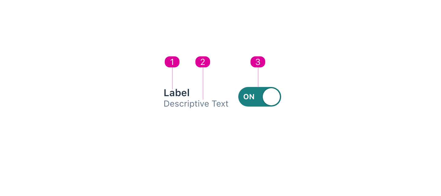
- Label - a short name that lets the user know what the switch will turn on or off.
- Description (optional) - a description that can be used to add clarity to the role of the switch.
- Control - an indicator that lets the user know the current state of the switch.
Usage
- When a user toggles a switch, its corresponding action takes effect right away.
- A switch has two mutually exclusive states—on and off.
React API
import { Switch } from '@wwnds/react';
Switch
<Switch label="Switch" />
| Name | Description | Type |
|---|---|---|
label (required) | The name of the Switch. Required. | ReactNode |
children | Children are set inside the Switch control. Default is 'ON' when | ReactNode |
tipped | Indicates that the label should be rendered as a tooltip. | boolean |
checked | The switch's initial "on" state. | boolean |
onToggle | A function to call when the switch is toggled. | ((checked: boolean) => void) |
displayDefault | Indicates whether the default control text should be used when no children
are provided. "ON" when | boolean |
baseName | The base class name according to BEM conventions. | string |
tooltipProps | Tooltip props that should be included when the switch's label is rendered as a tooltip. | Partial<TooltipCoreProps> |
description | An optional description. Use this in place of | ReactNode |
labelClass | A className for the label element, which will be a | string |
descriptionClass | A className for the description <div>. | string |
labelId | An id for the label element. | string |
descriptionId | An id for the description <div>. | string |
color | The button's color, restricted to design system colors,
excluding | "base" | SystemColors | "warning" | "primary" | "error" | "success" |
variant | Button variant conveys the button's level of visual emphasis. | "solid" | "outline" | "ghost" |
icon | An icon to include in the button. | IconVariant | SVGIcon |
iconRight | Indicates whether the icon should be to the right of the text. By default, the icon is to the left of the text. | boolean |
iconOnly | Indicates whether the button's contents should only be the icon. When
| boolean |
buttonRef | A reference to the inner <button> element. | Ref<HTMLButtonElement> |
iconClass | The className for the Button's icon, if one exists. | string |
textClass | The className for the Button's text, which will be placed in a <span> | string |
active | Whether the button is currently depressed. Polyfill for :active on keydown. | boolean |
activeClass | A class to convey :active. | string |