Choice Field
A choice field allows the user to choose one or more option from a set of related options.
Anatomy
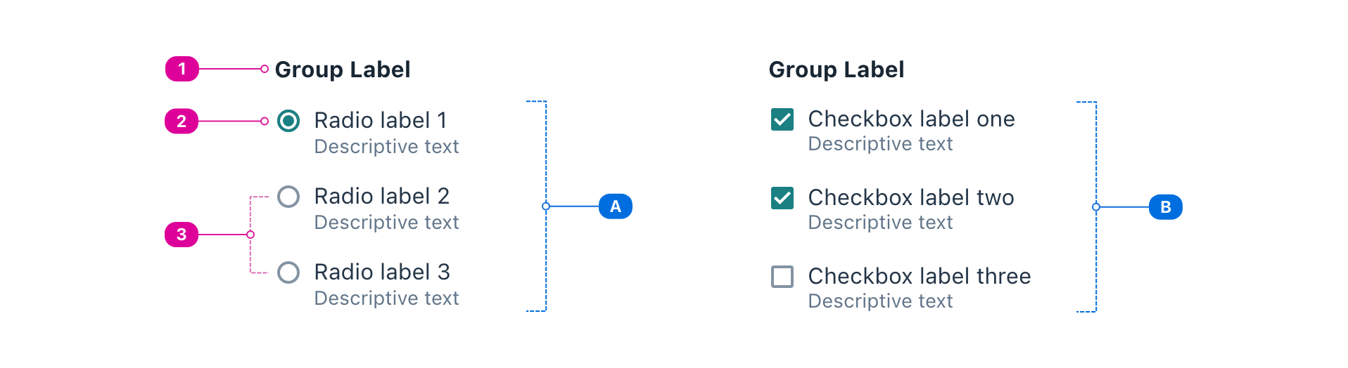
- Label - text that conveys how the choices are related and prompts the user to choose one or more choice.
- Current Selection - a selected choice indicates that it will be included when the field is submitted.
- Choices - the available choices.
- If the Choice Field is single-choice, all choices should be radio buttons (A).
- If the Choice Field is multiple-choice, all choices should be checkboxes (B).
Usage
In most cases, this component should not be used directly. Rather, you should choose ahead of time whether your field should be single-choice or multi-choice and use the corresponding implementation.
- For single-choice, use the Radio Group.
- For multi-choice, use the Checkbox Group.
React API
import { Choice, ChoiceField } from '@wwnds/react';
ChoiceField
To switch a ChoiceField between single- and multi-choice, add or remove the multiple prop.
<ChoiceField label="Choose your favorite fruits." name="fruit" multiple>
	<Choice>Apple</Choice>
	<Choice>Banana</Choice>
	<Choice>Kiwi</Choice>
	<Choice>Orange</Choice>
</ChoiceField>
| Name | Description | Type |
|---|---|---|
label (required) | Text that conveys how the choices are related and prompts the user to choose one or more choice. | ReactNode |
multiple | Whether the field is multi-select or single-select. | boolean |
name | The name that will be assigned to all child <input> elements. | string |
fieldName | The name that will be assigned to the parent <fieldset>. | string |
baseName | The base class name according to BEM conventions. | string |
choiceClass | The class name that will be used on all Choice elements. | string |
required | Indicates whether a selection must be made or not. | boolean |
requiredIndicator | Indicates that the indicator should be "required" when required=true. | boolean |
optionalIndicator | Indicates that the indicator should be "optional" when required=false. | boolean |
description | An optional description. Use this in place of | ReactNode |
labelClass | A className for the label element, which will be a | string |
descriptionClass | A className for the description <div>. | string |
labelId | An id for the label element. | string |
descriptionId | An id for the description <div>. | string |
errors | A list of error strings. If provided, this will be set as an unordered list in the first child slot. | string[] |
errorsClass | A className for the error list. | string |
errorsId | An id for the error list. | string |
Choice
<Choice>Apple</Choice>
| Name | Description | Type |
|---|---|---|
type | "checkbox" | "radio" | |
indeterminate | Mark the checkbox as indeterminate. Has no effect when Reference: | boolean |
requiredIndicator | Indicates that the indicator should be "required" when required=true. | boolean |
optionalIndicator | Indicates that the indicator should be "optional" when required=false. | boolean |
thumbnail | The thumbnail element. | ReactNode |
baseName | The base class name according to BEM conventions. | string |
controlClass | The className for the control that sighted users will see. | string |
inputClass | The className for the Checkbox's <input> element. | string |
thumbnailClass | The className for the Checkbox's thumbnail element. | string |
checkedClass | A className that will be applied to the root of the component when it is checked. | string |
description | An optional description. Use this in place of | ReactNode |
labelClass | A className for the label element, which will be a | string |
descriptionClass | A className for the description <div>. | string |
labelId | An id for the label element. | string |
descriptionId | An id for the description <div>. | string |
errors | A list of error strings. If provided, this will be set as an unordered list in the first child slot. | string[] |
errorsClass | A className for the error list. | string |
errorsId | An id for the error list. | string |
validators | A list of validators. A validator contains a function that tests the value for validity and a corresponding message that conveys why the test failed. | ValidatorEntry[] |
validateOnDOMChange | Indicates that validation should occur when the DOM's Reference: | boolean |
validateOnChange | Indicates that validation should occur when | boolean |
maxLengthRestrictsInput | Indicates that a maxLength value should prevent input beyond the maxLength. | boolean |
onDOMChange | A callback that will be triggered any time the DOM's Reference: | ((e: Event) => void) |
onValidate | A callback that will be triggered any time the input is validated. See
related | ((errors: string[]) => void) |