Popover
A popover allows the user to reveal more information or non-critical tasks in an overlay.
Anatomy
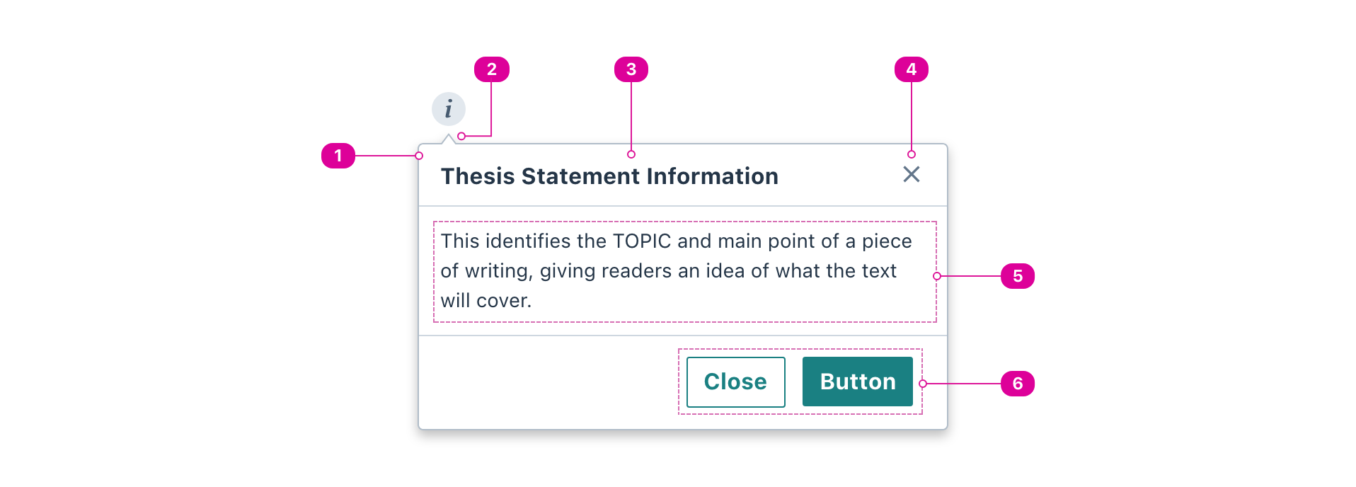
- Container Container - the popover's container overlays the main page's content.
- Arrow - a visual indicator that points to the related element.
- Title (recommended) - the title of a callout summarizes its contents.
- Close Button (optional) - a button that will always close the popover.
- Body - the contents of the popover.
- Action Buttons (optional) - one or more custom actions that will result in the popover closing.
Usage
Use a popover for progressive disclosure of complex related information or actions that don't belong on the main page.
React API
We expose one component for the popover API, the Popover.
Popover
The Popover component extends the React.ComponentPropsWithoutRef<'div'> interface and uses Popper.js for positioning.
import { Popover } from '@wwnds/react';
function PopoverExample() {
	const [isOpen, setIsOpen] = React.useState(false);
	const [ref, setRef] = React.useState();

	return (
		<>
			<Button variant="solid" ref={setRef}>
				Show popover
			</Button>
			<Popover
				title="Title"
				hideTitle={false}
				hideCloseButton={false}
				placement="top"
				reference={ref}
				isOpen={isOpen}
				onRequestClose={() => setIsOpen(false)}
				onRequestOpen={() => setIsOpen(true)}
			>
				Lorem ipsum dolor sit amet, consectetur adipiscing elit,
				sed do eiusmod tempor incididunt ut labore et dolore magna aliqua.
				Ut enim ad minim veniam, quis nostrud exercitation ullamco
			</Popover>
		</>
	);
}
| Name | Description | Type |
|---|---|---|
title | The name of the Modal dialog. Required for accessibility but can be
visually hidden with the | string |
hideTitle | Indicates that the title should be visually hidden. It will still be accessible to screen reader users. | boolean |
hideCloseButton | Indicates that the built-in close button in the top right should not be rendered. | boolean |
actions | A list of actions or React Fragment that will be set inside an action bar at the bottom of the Modal dialog. | ReactNode | ReactElement<ButtonProps, string | JSXElementConstructor<any>>[] |
baseName | The base class name according to BEM conventions. | string |
headerClass | A className for the popover's header. Default will be ${baseName}__header. | string |
titleClass | A className for the popover's title, which goes inside the header.
Default will be | string |
closeButtonClass | A className for the popover's close button, which goes inside the header.
Default will be | string |
bodyClass | A className for the body of the popover, where the | string |
actionBarClass | A className for the popover's action bar footer. Default will be ${baseName}__actionbar. | string |
arrowClass | A className for the popover's arrow. Default will be | string |
onOpen | Callback function that is called after the popover opens. The default function will focus the popover. Use this callback to focus something else inside the popover. | ((popoverElement: HTMLElement) => void) |
onClose | Callback function that is called after the popover closes. The default function will focus the reference element that opened the popover. | ((shouldFocusReference: boolean) => void) |
isOpen | Used to control whether the popper is open or closed. | boolean |
transition | The animation transition class applied to the popper as it enters or exits. A single name can be provided and it will be suffixed for each stage. For example,
Each individual stage can also be specified independently: Reference: react-transition-group's CSSTransition. | string | CSSTransitionClassNames |
reference | The reference element that the popper will be attached to. | ReferenceElement | null |
arrowElement | The element that should be used for the arrow. See the | string | Element | MutableRefObject<Element | null> | null |
distance | The offset distance
(in pixels) from the reference. Will only be used if | number |
boundary | The element or area where the popper will be checked against for overflow. See the | Boundary | "clippingParents" |
placement | The Floating UI placement option. | "auto" | Placement | "auto-start" | "auto-end" |
modifiers | Legacy Popper modifier objects. Supported names: | { name?: string; enabled?: boolean | undefined; options?: Record<string, unknown> | undefined; }[] | undefined |
strategy | The Floating UI strategy option. | Strategy |
onFirstUpdate | Called after the popper receives its first computed position while open. | ((state: { elements: { popper: HTMLElement; reference: ReferenceElement; }; placement: Placement; }) => void) |
hideDelay | The duration in milliseconds that should elapse before closing, beginning
after the pointer exits the reference's bounding box. Only has an effect
for the | number |
showDelay | The duration in milliseconds that should elapse before opening, beginning
after | number |
onRequestClose | A callback that occurs when the popper wants to close. The reason it is making this request is given by the first parameter.
| ((triggeredBy: PopperTriggersClose) => void) |
onRequestOpen | A callback that occurs when the popper wants to open. The reason it is making this request is given by the first parameter.
| ((triggeredBy: PopperTriggersOpen) => void) |