Disclosure
A disclosure allows the user to show and hide additional content.
Anatomy
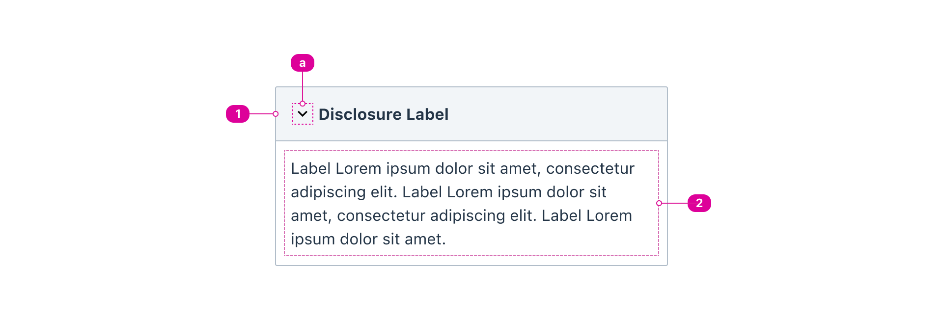
- Summary Button - a button used to summarize what is conveyed in the disclosure body.
- Summary Marker - a visual indicator of the disclosure state.
- Body - displays the content when expanded and hides the content when collapsed.
Usage
- Use a disclosure when you want to help the users manage their attention on the page.
- A disclosure has two states: collapsed and expanded. A disclosure is collapsed by default.
- A disclosure’s summary button should clearly and succinctly describe its hidden content, allowing users to quickly identify relevant sections without needing to expand every disclosure.
- Ensure that the entire summary button is selectable.
- If multiple related disclosures are needed, use an (accordion).
React API
import { Disclosure } from '@wwnds/react';
Disclosure
<Disclosure panel summary="Default disclosure">
    Lorem ipsum dolor sit amet consectetur adipisicing elit.
</Disclosure>
| Name | Description | Type |
|---|---|---|
summary (required) | The content for the summary element generated by the disclosure component. | ReactNode |
marker | The marker icon that indicates the disclosure's current state. Similar to the
CSS | IconVariant | SVGIcon | ((panel?: boolean) => IconVariant | SVGIcon | null) | null | undefined |
markerPosition | The position of the marker. right when panel={true} and left otherwise. | "right" | "left" | ((panel?: boolean) => "right" | "left" | null) | null | undefined |
markerTransform | How the marker should move when it opens. Default is "rotate-90". | "none" | "rotate-90" | "flip-3d" |
isOpen | Used to set the initial open state or fully control it. | boolean |
panel | Indicates that the disclosure should be in "panel" mode, which has a few effects:
| boolean |
reducedMotion | Indicates that animations should be disabled. | boolean |
baseName | The base className according to BEM conventions. | string |
summaryClass | The className that will be applied to the <summary>. | string |
contentsOuterClass | The className for the outer contents <div>. | string |
contentsInnerClass | The className that will be applied to the inner contents <div>. | string |
markerClass | The | string |
onCloseStart | Lifecycle method that is triggered when the disclosure begins to close.
Returning | LifecycleCallback |
onCloseCancel | Lifecycle method that is triggered when the user clicks on the disclosure
as it's closing. Returning | LifecycleCallback |
onCloseEnd | Lifecycle method that is triggered when the disclosure has finished closing. | LifecycleCallback |
onOpenStart | Lifecycle method that is triggered when the disclosure begins to open.
Returning | LifecycleCallback |
onOpenCancel | Lifecycle method that is triggered when the user clicks on the disclosure
as it's opening. Returning | LifecycleCallback |
onOpenEnd | Lifecycle method that is triggered when the disclosure has finished opening. | LifecycleCallback |