Text Field
A text field allows the user to enter and edit text.
Anatomy
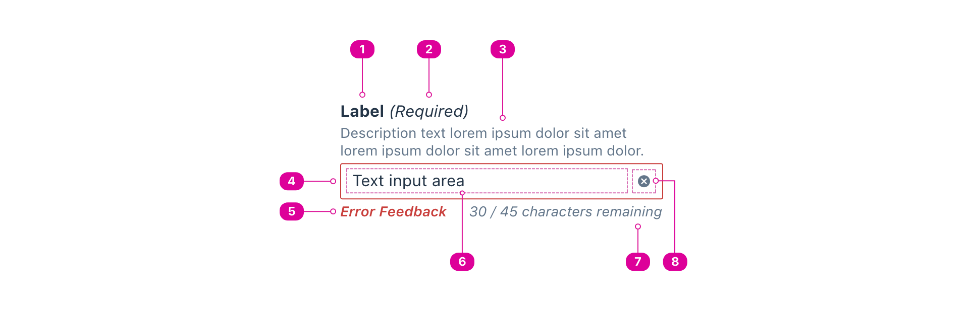
- Label - a short name that lets the user know what to type in the field.
- Field Indicator (optional) - a parenthetical that lets the user know whether the field is required or optional. Use this to bring attention to a field that is the “odd one out.” For instance, if there are five fields in a form and only one is optional, the field indicator should say “(optional)” for that one instead of “(required)” for the other four.
- Description (optional) - additional text that can be used to add clarity to the role of the text field or help the user understand the expected input format.
- Input Container - a container that outlines the boundary of text field’s input area and addons.
- Error Feedback (optional) - feedback that lets the user know that their current input is invalid and why.
- Input Area - where the user enters text.
- Character Counter (optional) - an indicator that lets the user know how many characters *
- Addon(s) (optional) - field addons help the user control the state of the text field. Addons can be included before or after the input area.
Usage
- A text field allows a user to freeform type or paste their own response to a prompt.
- A text field has a label that describes what the user should type.
- A text field’s label must be visible at all times.
- A text field’s label must be associated with its input. To associate a label with an input, either use the for attribute or wrap the input in the label element.
Usage: Search
- A basic search field uses the text field component.
- The search field should always include a button with a magnifying glass icon. This icon is the universally recognizable symbol for search and what people will look for when they want to find the search field. The button submits the search query and gives the user the search results.
- For search that allows users to find information or links within an entire website or application, the field should always be at the top right of the screen, usually contained within the top navigation bar or header. The search bar should be at the top of almost every screen/page, except for processes where searching would interrupt the user’s flow or progress, such as checkout.
- Search can also be used to help users find information within a specific section of the website/application or within a component, like a table. In this case, the search bar should be clearly associated with the section or component it applies to so users don’t confuse it with
Content Guidelines
- The search field should have a clear and meaningful label. For search within a section or component, the label should add context, such as “Search books.”
- Use the description if necessary for example search queries, especially if the format is important, such as dates.
Interactions
- Enter submits the search query.
Types
Text field types are based on the HTML input types that do not require a separate interface for entry, such as a date picker.
Where possible, they should be implemented with their corresponding <input> type.
Number
- Allows the user to enter a number, and can display step arrows on focus.
- Includes built-in validation to reject non-numeric text entry.
- The default step value is 1, but can be set with more or less granularity, including decimal values.
- Allow users to use the up and down arrows on their keyboard to adjust the value typed into the field.
Email
- Allows the user to enter an email address or list of email addresses.
- Includes built-in validation to ensure text entry is a properly formatted email address.
- Some devices may display an email-specific keyboard for easier entry.
- Can allow the user's browser to automatically fill out the field, if enabled.
Password
- Allows the user to securely enter a password by obscuring the text entry.
- Can allow the user’s browser or password manager to automatically fill out the field.
URL
- Allows the user to enter a URL.
- Includes built-in validation to ensure text entry is a properly formatted URL.
- Some devices may display a URL keyboard for easier entry.
Tel
- Allows the user to enter a telephone number.
- The text entry is not automatically validated, because telephone numbers vary around the world.
- Some devices may display a telephone keyboard for easier entry.
Text Wrapping Variants
If the user inputs text that cannot fit inside the visible text field container, the text must either wrap or the container must scroll with the text. Three options are provided to address this need.
Single line text field
- A single-line text field displays only one line of text.
- As the cursor reaches the right edge of the input area, text longer than the input area automatically scrolls left.
- Use single-line text fields for: Number, Email, Password, and Tel inputs.
Multi-line text field: Fixed height (default)
- Multi-line text fields have a fixed height by default
- Text longer than the input area wraps onto a new line, and scrolls vertically when the cursor reaches the bottom of the input area.
- The large size of the input area indicates that longer responses are possible and encouraged.
- Use fixed height multi-line text fields for: free response inputs with additional formatting capabilities.
Multi-line text field: Autosize (optional alternative)
- Autosize multi-line text fields grow to accommodate multiple lines of text and show all text entry at once.
- Autosize multi-line text fields initially appear as single-line fields, which is useful for compact layouts that need to accommodate large amounts of text.
- Text longer than the input area wraps to a new line. The input area expands vertically and shifts any screen elements below it.
- Use autosize multi-line text fields for: free response input and URLs.
React API
import { TextField } from '@wwnds/react';
TextField
TextField provides a single interface for a complete <input> field.
Internally, it uses the FieldInfo, FieldFeedback, and FieldAddon components.
<TextField
	maxLength={30}
	description="Use the description to display hints about entry."
	required
	requiredIndicator
	validateOnChange
>
	Default text field
</TextField>
| Name | Description | Type |
|---|---|---|
type | Text fields can be a limited subset of | "number" | "search" | "text" | "email" | "tel" | "url" | "password" |
addonBefore | One or more addon that should be included before the <input>. | ReactNode |
addonAfter | One or more addon that should be included after the <input>. | ReactNode |
feedback | Feedback about the user's current input value. By default, this will
contain validation errors and the counter, if | string | ReactElement<unknown, string | JSXElementConstructor<any>> |
counterStart | When the character counter should begin showing. | number |
counter | A function that takes the remaining number of characters and the maximum number of characters and returns the string or element that will be rendered in the character counter slot. | false | (({ remaining, max }: { remaining: number; max: number; }) => ReactNode) |
baseName | The base class name according to BEM conventions. | string |
inputClass | The className for the TextField's <input> element. | string |
addonClass | The className for all of the addons (before and after). | string |
groupClass | The className for the wrapper that contains the <input> & addons. | string |
feedbackClass | The className for the TextField's feedback section, which contains the error text and character count. | string |
counterClass | The className for the TextField's character counter element. | string |
invalidClass | A className that will be applied to the base element when the | string |
inputRef | A reference to the internal <input> element. | Ref<HTMLInputElement | HTMLTextAreaElement> |
requiredIndicator | Indicates that the indicator should be "required" when required=true. | boolean |
optionalIndicator | Indicates that the indicator should be "optional" when required=false. | boolean |
onCount | Triggered any time the number of characters remaining is updated. | ((remaining?: number) => void) | undefined |
multiline | Allow for multiple lines of input | number | boolean |
autoSize | If | boolean |
description | An optional description. Use this in place of | ReactNode |
labelClass | A className for the label element, which will be a | string |
descriptionClass | A className for the description <div>. | string |
labelId | An id for the label element. | string |
descriptionId | An id for the description <div>. | string |
errors | A list of error strings. If provided, this will be set as an unordered list in the first child slot. A list of validation errors. When the input is submitted in a form, the list will be concatenated into a single string with a new line separator. | string[] |
errorsClass | A className for the error list. | string |
errorsId | An id for the error list. | string |
validators | A list of validators. A validator contains a function that tests the value for validity and a corresponding message that conveys why the test failed. | ValidatorEntry[] |
validateOnDOMChange | Indicates that validation should occur when the DOM's Reference: | boolean |
validateOnChange | Indicates that validation should occur when | boolean |
maxLengthRestrictsInput | Indicates that a maxLength value should prevent input beyond the maxLength. | boolean |
onDOMChange | A callback that will be triggered any time the DOM's Reference: | (((e: Event) => void) & ((e: Event) => void)) |
onValidate | A callback that will be triggered any time the input is validated. See
related | (((errors: string[]) => void) & ((errors: string[]) => void)) |
FieldInfo
The FieldInfo component is used to information about a related field.
It will always contain a label for the field and can contain an optional description.
Make sure to include a valid htmlFor prop when used with form controls such as an <input>.
<FieldInfo description="Use the description to display hints about entry.">
	Default text field
</FieldInfo>
| Name | Description | Type |
|---|---|---|
baseName | string | |
label (required) | The name of the field. Required. | ReactNode |
indicator | An additional label indicator, displayed as a parenthetical inside the
label container. For instance, | string | null |
indicatorClass | A className for the indicator <span>. | string |
labelTag | The HTML element name for the label. If | "label" | "div" | "legend" |
description | An optional description. Use this in place of | ReactNode |
labelClass | A className for the label element, which will be a | string |
descriptionClass | A className for the description <div>. | string |
labelId | An id for the label element. | string |
descriptionId | An id for the description <div>. | string |
FieldFeedback
A container for field feedback. Use to display content based on field input.
<FieldFeedback errors={['Something went wrong', 'Another thing isn\'t right']}>
	Generic feedback goes here
</FieldFeedback>
| Name | Description | Type |
|---|---|---|
liveErrors | Indicates whether errors should be a live region. Default is | boolean |
baseName | The base class name according to BEM conventions. | string |
errors | A list of error strings. If provided, this will be set as an unordered list in the first child slot. | string[] |
errorsClass | A className for the error list. | string |
errorsId | An id for the error list. | string |
FieldAddon
The FieldAddon is a simple container for input addons.
It is used by the TextField component to render addons before or after the <input>.
<FieldAddon>
	<IconButton icon="check">Correct</IconButton>
</FieldAddon>
| Name | Description | Type |
|---|---|---|
baseName | string |